Climate change and anomalies

The following layout settings are made:
The following packages are installed in RStudio:
Climate change and temperature anomalies
If we wanted to study climate change, we can find data on the Combined Land-Surface Air and Sea-Surface Water Temperature Anomalies in the Northern Hemisphere at NASA’s Goddard Institute for Space Studies. The tabular data of temperature anomalies can be found here
To define temperature anomalies I need to have a reference, or base, period which NASA clearly states that it is the period between 1951-1980.
I ran the code below to load the file:
weather <-
  read_csv("https://data.giss.nasa.gov/gistemp/tabledata_v4/NH.Ts+dSST.csv",
           skip = 1,
           na = "***")
NOTE: When using this function, I added two options: skip and
na:
The
skip=1option is there as the real data table only starts in Row 2, so I need to skip one row.na = "***"option informs R how missing observations in the spreadsheet are coded. When looking at the spreadsheet, you can see that missing data is coded as “***”. It is good practice to specify this here, as otherwise some of the data is not recognized as numeric data.Once the data is loaded, there is an object titled
weatherin theEnvironmentpanel.
Side note: If you cannot see the panel (usually on the
top-right), go to Tools > Global Options > Pane Layout and tick the checkbox next to Environment. Click on the weather object, and the dataframe will pop up on a seperate tab. Inspect the dataframe.
For each month and year, the dataframe shows the deviation of temperature from the normal (expected). Further, the dataframe is in wide format.
Cleaning the data
First, I cleaned the data to leave only the relevant ones for the analysis:
Selected the year and the twelve month variables from the
weatherdataset.Converted the dataframe from wide to ‘long’ format, and named the new dataframe as
tidyweather, the variable containing the name of the month asmonth, and the temperature deviation values asdelta.
# Create tidyweather data
tidyweather <- weather %>%
  select(-c("J-D", "D-N", "DJF", "JJA", "MAM", "SON")) %>%
pivot_longer(cols = -Year, names_to = "month", values_to = "delta")- Then, I inspected this dataframe to have three variables now, one each for:
- year,
- month, and
- delta, or temperature deviation.
Plotting Information
For the purpose of the analysis, I needed to plot the data using a time-series scatter plot, and add a trendline.
To do that, I first needed to create a new variable called date in order to ensure that the delta values are plot chronologically.
NOTE:
> In the following chunk of code, I used the eval=FALSE argument, which does not run a chunk of code;
I did so that I can knit the document before tidying the data and creating a new dataframe
tidyweather.
To actually run this code and knit this document,
eval=FALSEmust be deleted, not just here but in all chunks wereeval=FALSEappears.
# Set date format tidyweather data
tidyweather <- tidyweather %>%
mutate(date = ymd(paste(as.character(Year), month, "1")),
month = month(date, label=TRUE),
year = year(date))
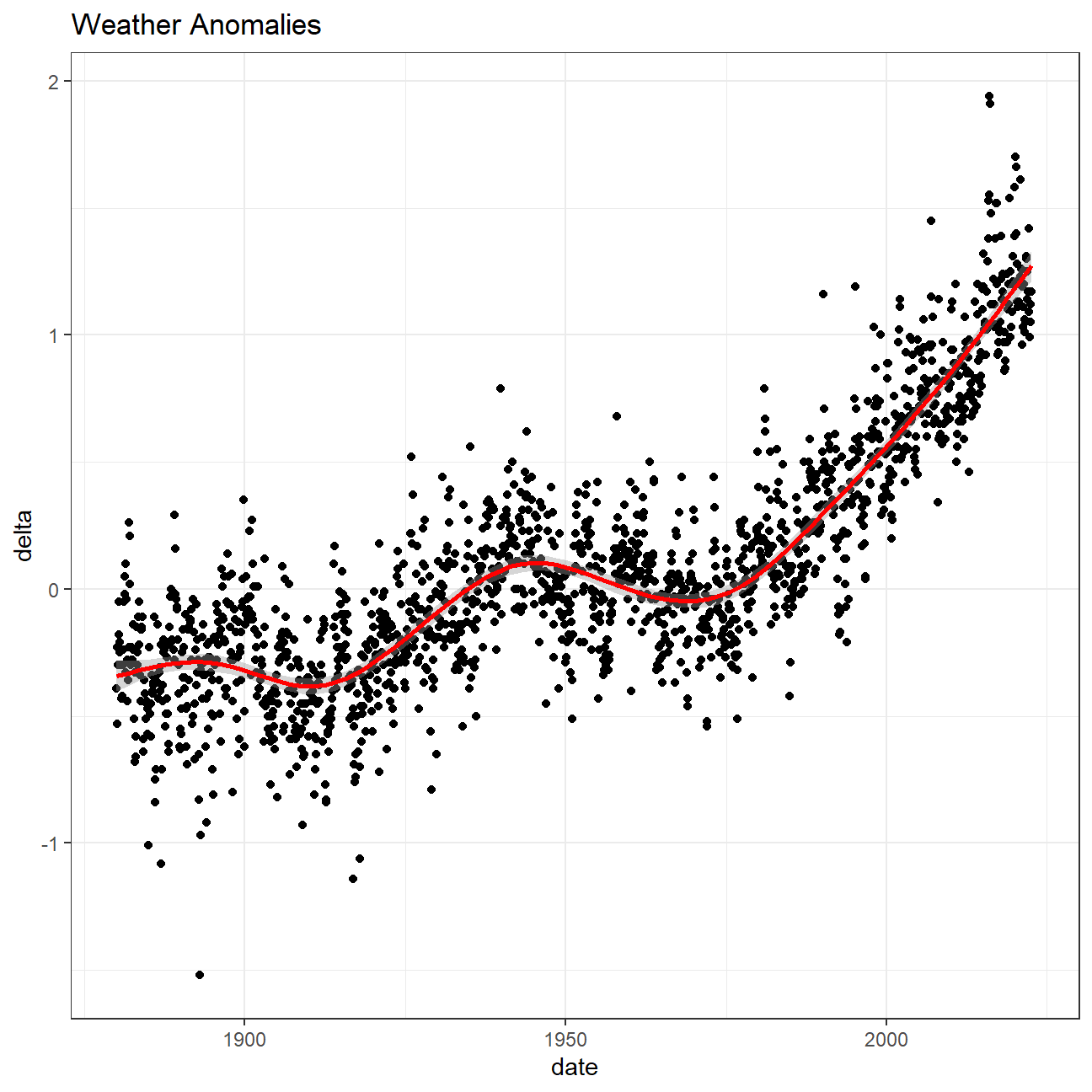
# Plot weather anomalies
ggplot(tidyweather, aes(x=date, y = delta))+
geom_point()+
geom_smooth(color="red") +
theme_bw() +
labs (
title = "Weather Anomalies"
)
To verify if the effect of increasing temperature is more pronounced in some months, I used facet_wrap() to produce a separate scatter plot for each month, again with a smoothing line.
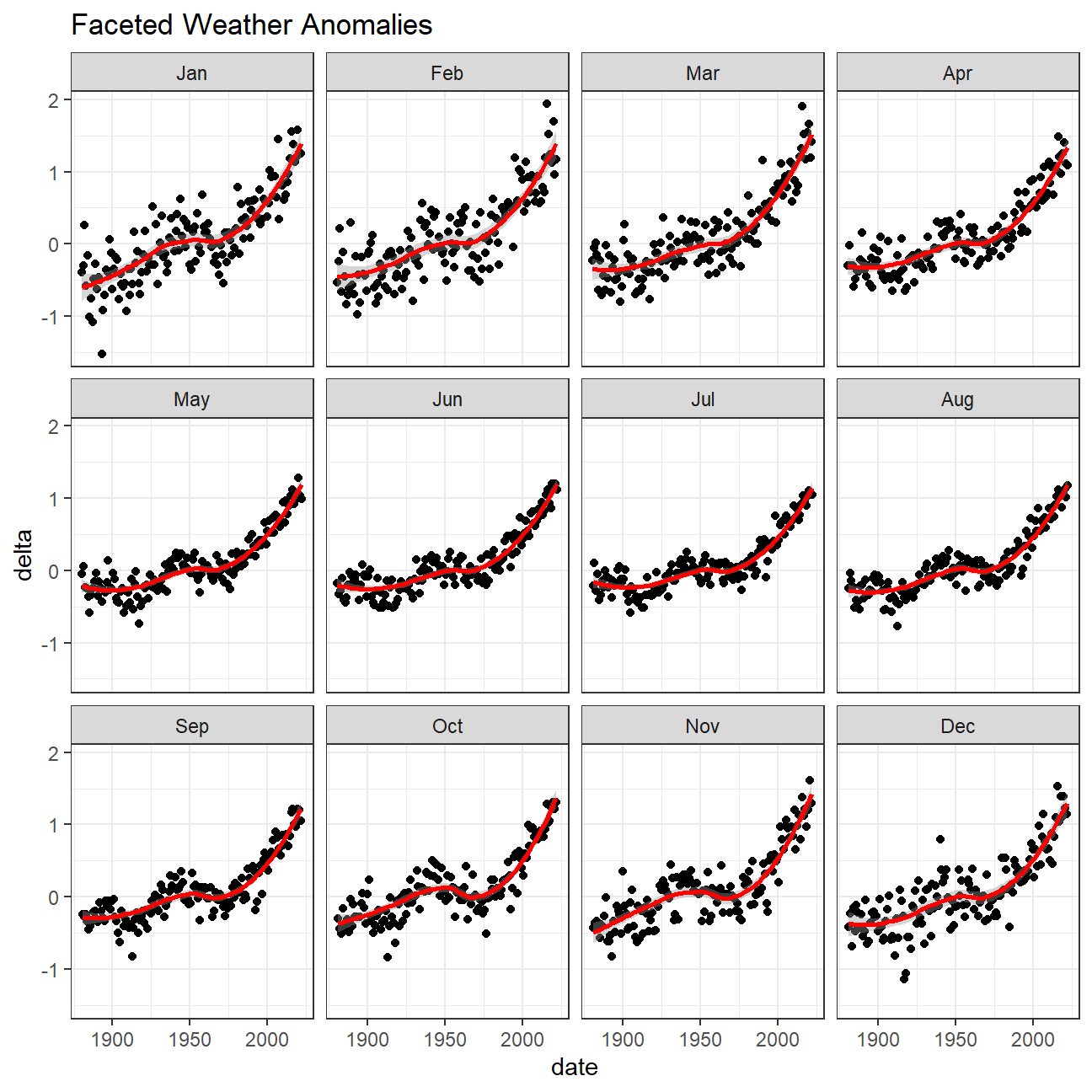
Conclusion 1:
Based on the plots, it can be implied that the effect of increasing temperature is more pronounced in the winter months - starting from the end of fall until the start of spring. I can see this from the higher values within the winter months over the other months across time. This reflects the effects of global warming/climate change throughout the last decade.
NOTE: - It is sometimes useful to group data into different time periods to study historical data. For example, we often refer to decades such as 1970s, 1980s, 1990s etc. to refer to a period of time. > Here, NASA calculates a temperature anomaly, as a difference from the base period of 1951-1980.
With the code below I:
- Created a new data frame called comparison that groups data in five time periods: 1881-1920, 1921-1950, 1951-1980, 1981-2010 and 2011-present.
- Removed data before 1800 and before using filter.
- Used the mutate function to create a new variable interval which contains information on which period each observation belongs to.
- Assigned the different periods using case_when().
# Assign periods
comparison <- tidyweather %>%
  filter(Year>= 1881) %>%     #remove years prior to 1881
  #create new variable 'interval', and assign values based on criteria below:
  mutate(interval = case_when(
    Year %in% c(1881:1920) ~ "1881-1920",
    Year %in% c(1921:1950) ~ "1921-1950",
    Year %in% c(1951:1980) ~ "1951-1980",
    Year %in% c(1981:2010) ~ "1981-2010",
    TRUE ~ "2011-present"
  ))
Next:
- Inspected the comparison data frame by clicking on it in the
Environment pane.
Now, that I have the
intervalvariable, I could create a density plot to study the distribution of monthly deviations (delta), grouped by the different time periods we are interested in.Set
filltointervalto group and colour the data by different time periods.
# Create density plot of monthly deviation based off each interval period
ggplot(comparison, aes(delta, fill = interval, alpha = 0.1)) +
  geom_density() +
  labs(title = "Denisty plots of monthly deviations", subtitle = "Separated by Intervals", x = "Delta", y = "Density") +
  theme(plot.title = element_text(size = 14, hjust = 0.5),
        plot.subtitle = element_text(size = 12, hjust = 0.5),
        axis.title = element_text(size = 12),
        axis.text = element_text(size = 10)
)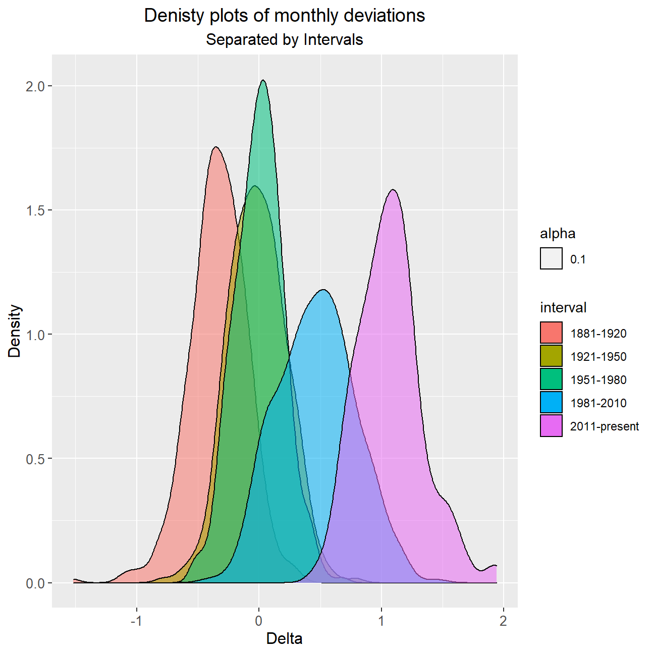
Conclusion 2:
From 1881 until 1980, I did not observe huge anomalies in terms of temperature delta from the base period (1951-1980). However, this was not reflected past 1980; temperatures began rising more drastically from 1981-present. More strikingly, the average delta for the last period is around 0.5 higher than that of the previous period (1981-2010). This hints at even higher average deviations in future that come faster unless a downward pressure is exerted on temperature increases through climate change measures.
So far, I have been working with monthly anomalies. However, we might be interested in average annual anomalies. I did this by using:
- group_by() and summarise(), followed by
- a scatter plot to display the result.
# Create yearly averages
average_annual_anomaly <- comparison %>%
  group_by(Year) %>%
  summarise(mean_delta_year = mean(delta))

# plot mean annual delta across years:
ggplot(average_annual_anomaly, aes(x = Year, y= mean_delta_year)) +
  geom_point() +
  geom_smooth(colour = "red", method = "loess") +
  theme_bw() +
  labs (
    title = "Yearly Weather Anomalies",
    y = "Mean annual delta"
  )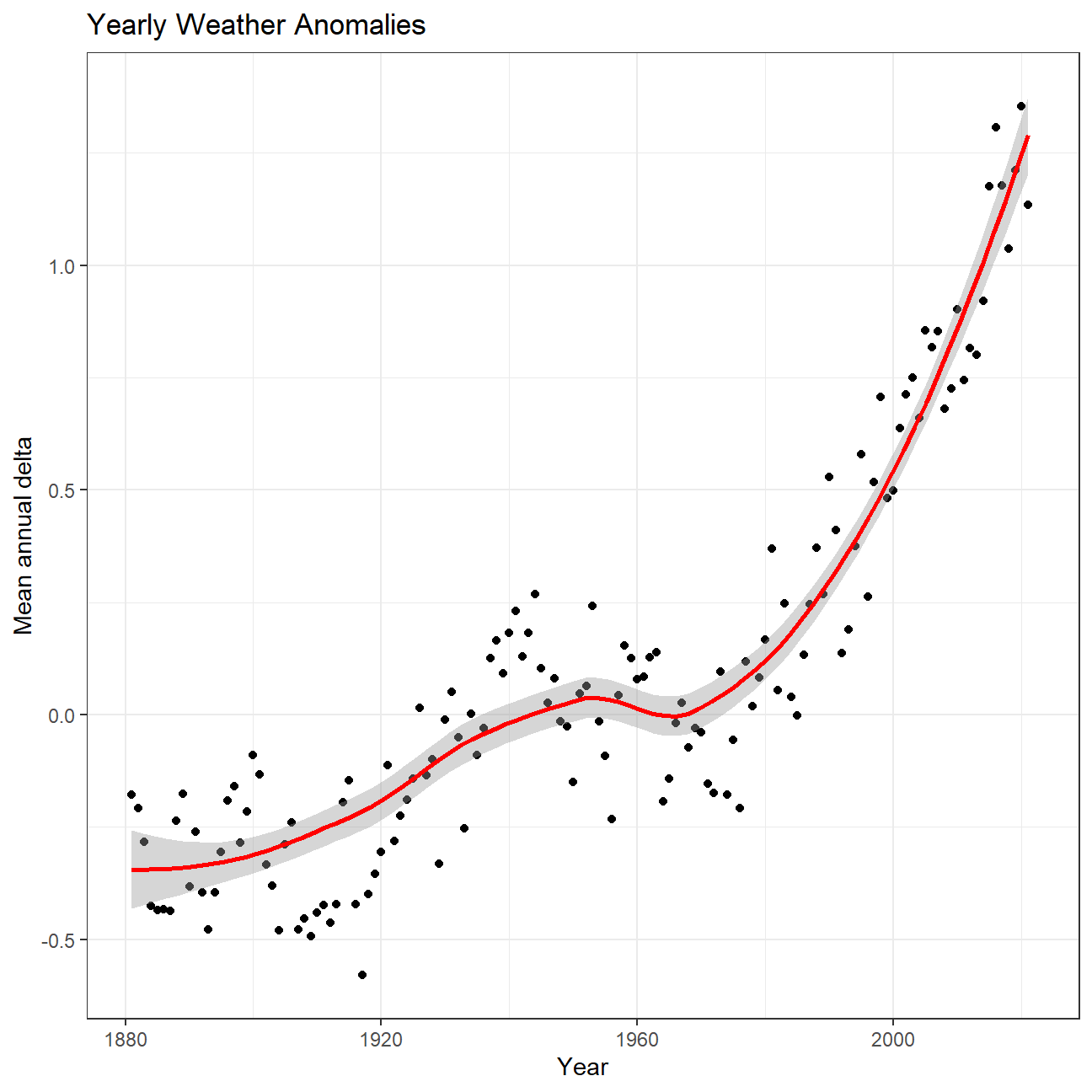
#Fit the best fit line, using LOESS method
#change theme to theme_bw() to have white background + black frame around plot
Conclusion 3:
Like what I was hinting at earlier, the yearly anomalies over the past four decades (starting from 1980) have followed a relatively exponential upward trend. During the 1980s, the average yearly delta was between 0 and 0.5 whereas this average has climbed past 1.5 in the most recent years. This increase of 1 degree overall has not been witnessed in the century prior to 1980, thus emphasising the magnitude of the rapidly worsening global warming phenomenon.
Confidence Interval for delta
NASA points out on their website that
A one-degree global change is significant because it takes a vast amount of heat to warm all the oceans, atmosphere, and land by that much. In the past, a one- to two-degree drop was all it took to plunge the Earth into the Little Ice Age.
Here, I constructed a confidence interval for the average annual delta since 2011, both using a formula and using a bootstrap simulation with the infer package.
NOTE:
Recall that the dataframe comparison has already grouped temperature anomalies according to time intervals; => we are only interested in what is happening between 2011-present.
# Formula method of CI calculation
formula_ci <- comparison %>%
  filter(interval == "2011-present") %>%
  drop_na() %>%
  summarise(mean_delta = mean(delta),
                     sd_delta = sd(delta),
                     count = n(),
                     t_critical = qt(0.975, count-1),
                     se_delta = sd_delta / sqrt(count),
                     margin_of_error = t_critical * se_delta,
                     delta_low  = mean_delta - margin_of_error,
                     delta_high  = mean_delta + margin_of_error
            )
# Print out formula_CI
formula_ci
## # A tibble: 1 × 8
## mean_delta sd_delta count t_critical se_delta margin_of_error delta_…¹ delta…²
## <dbl> <dbl> <int> <dbl> <dbl> <dbl> <dbl> <dbl>
## 1 1.07 0.265 140 1.98 0.0224 0.0443 1.02 1.11
## # … with abbreviated variable names ¹delta_low, ²delta_highlibrary(infer)
# Bootstrap method of CI calculation using Infer package
infer_bootstrap_ci <- comparison %>%
filter(interval == "2011-present") %>%
specify(response = delta) %>%
generate(reps = 1000, type = "bootstrap") %>%
calculate(stat = "mean", na.rm = TRUE) %>%
get_confidence_interval(level = .95)
# Print out bootstrap CI using Infer package
infer_bootstrap_ci## # A tibble: 1 × 2
## lower_ci upper_ci
## <dbl> <dbl>
## 1 1.02 1.11Conclusion 4:
The results give an interesting insight into the sea and land temperature differences during the 2011 - present time interval. The mean of the temperature delta is around 1.06 degrees. By means of a confidence interval calculation I can state with 95% certainty that the mean temperature delta is between 1.02 and 1.11 degrees for this time period. As there is no underlying distribution, I used the t-statistics and a degrees of freedom of n-1 to calculate the critical values required for a confidence interval calculation.
I confirmed this estimate by using a bootstrapping method that manually created the confidence intervals and provided a lower bound of 1.02 degrees and a upper bound of 1.11 degrees.